I’m sure if you have ever had something professionally printed, you’ve probably heard a few terms that made absolutely no sense.
Many people without experience working in print shops don’t know what it means when your printer asks if your artwork has bleeds or if it’s 4/0. This can cause frustration for everyone involved. So why not learn the lingo and impress your print shop the next time you need print work done?
What is a Print Bleed?
What is the importance of a bleed and why do you need to include it on certain designs that are being printed?
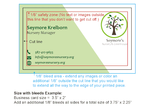
A bleed is needed when you have any printing that extends beyond your piece’s final size.
If you have a design element that needs to go to the edge of the piece, like a background or image, then you need a bleed.
Why do you need a bleed?
Most printing equipment does not have the capability to print all the way to the edge of a sheet. In fact, you’ve probably noticed this when printing out an image or document with elements that are flush to the edge of the paper., it will print with a white border cutting off anything in that area.
What is the proper print bleed size?
In order to have your design extend all the way to the edge of your finished piece, it needs to be printed oversized, then cut down to size.
Due to slight movement in printing, cutting, and variances in paper sizes, the design needs to include an 1/8” additional area that can be trimmed off to prevent any white space from showing at the edge of your finished piece. That means, you also need to have at least an 1/8” safety zone on your design for anything you don’t want to be cut off.
What is DPI?
What is it, what is the standard dpi for print and how does it affect my images when printing?
These questions are quite common and are a common source of frustration when printing photos.
DPI is the appreviation for “dots per inch” and is used to measure the number of dots that can be placed in a line within a one-inch span.
Why is high DPI important?
Image DPI is important because if it’s too low and your image is enlarged you’ll lose clarity and reveal nasty pixelation.
It’s important to note that the term ‘resolution’ is a general term that is used to describe the detail level of an image, while DPI is a unit of measurement used to quantify resolution. Resolution can be used in a wide variety of circumstances, while DPI is largely used in digital printing technologies. (and gaming mice… who knew?)
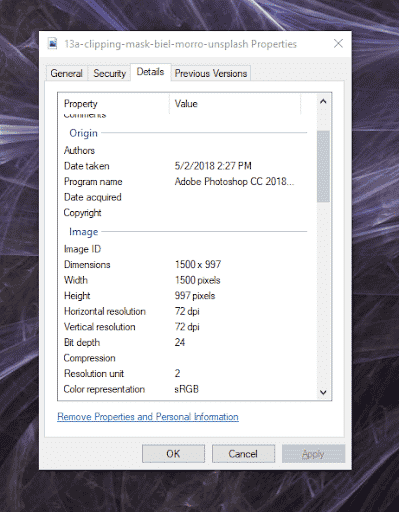
How to check the resolution of an image
If you are not sure what size your photos are and you don’t have Photoshop, you can check them another way. First, locate the photo in your file explorer. Then, you need to right-click on the image you would like to check and scroll to properties. Once you click on properties, a small screen should pop up. Find the details tab at the top and click on it. This will show you all of the details for that image. Scroll down to Horizontal Resolution and Vertical Resolution and look at the number. This will tell you the DPI of your image.
What is the standard DPI for print?
When adding images to anything printed piece, such as flyers and brochures, you want to make sure all of your images are 300 dpi.
If you use images that have lower dpi, your photos may not turn out clear and can even cause what printers call “pixelation”. Pixelation is the blurriness or fuzziness in an image due to the visibility of pixels. Pixels are the tiny little squares that make images.
If you take a look at the images below, you can see the one on the left looks a little more fuzzy and blurry than the one on the right. That’s because the photo on the left is saved at 72 dpi and the one on the right is saved at 300 dpi.


Important Tidbit: It is important to check your image’s dpi if you are using photos from the internet. Most images on the web are a much smaller 72dpi.
What to do if your image resolution is too low
Now, there are situations when you can get away with having a slower DPI, like 72, so here are a few ways to increase your DPI if you don’t have design programs like photoshop.
- Check your image dimensions – sometimes you can get away with an image that has lower dpi if it’s big enough. On most modern cellphones the cameras are so good they produce images so large you could practically make a mural out of them. If you’re image dimensions are upwards of 3000×4000 pixels that image can be used for most standard printed materials. (you can check the size of your image by using the same method we detailed above or by opening the image details on your phone.)
- Convert your image to the proper DPI – There are several tools, but one we recommend is clideo.com. This site is super simple plus it has several DPIs to choose from when converting your image. Do be aware the downside to increasing DPI is the actual dimension can be reduced so be aware when doing this.
- Let the experts take care of it – If you’re worried you may mess something up then just provide the largest file size possible to your printer so they can do the conversion themselves. This may have an additional cost but most printers, like Third Angle, include this within any artwork fee.
What is the difference between a Vector Image and a Raster Image?
The vector vs raster image battle is all too familiar and can be quite frustrating when you’re trying to place things such as logos or illustrated graphics.
What is a Vector Image?
A Vector image, better known as vector graphics, is a form of computer graphics created by using points, lines, curves, and polygons that aren’t restricted by DPI or resolution.. Almost all vector shapes are created using design programs, like Adobe Illustrator, Corel Draw, or even Canva, and have the ability to be scaled without losing any image quality ( think pixelation). When using vector graphics, it is best practice to send your printer an, SVG, EPS, AI, or editable pdf file type. This allows your printer to print your logo with clarity and detail.
What is a Raster Image?
A raster (or bitmap) image is a photo or image made up of pixels. While these are great if you are adding photos to your printed materials, you don’t want to send raster versions of any logos, or other illustrated graphics because if you enlarge these types of images you can lose the quality of the image.
Why it is important to know if your file is vector or raster?
When you send a rasterized version of a logo or chart you are at the mercy of sizing, which can again cause pixelation. If you notice in the image below one S looks nice and crisp but the other looks jagged and fuzzy. The one on the left is a vector and the one on the right is a rasterized image.
Why do my colors look different on screen than what’s printed?
What is CMYK, RGB, and PMS and how do those affect my print jobs?
To start off, these terms are all various types of color systems used in both web and print. However, no matter how accurate any of these color spaces are it’s important to note that all monitors are slightly different which makes colors look different. To boot, depending on the production method used to produce your printed item your colors could shift.
Here is a quick breakdown of the difference between RGB vs CMYK vs PMS:
What is CMYK?
(Cyan, Magenta, Yellow, and Black) is the most common color breakdown for printers and is pigment-based. Depending on the machine these colors are either liquid ink or powdered toner. There are even some printers that can print white or even metallics! But, don’t assume your printer can do this as it is not common.
What is RGB?
(Red, Green, Blue) is used for digital screens and is a light-based color process. While RGB is superior as it can create billions of colors its fatal flaw is since the print is based on the physical work (for now) those colors are reduced down to only a few thousand colors. If you’ve designed something and like the color, you see on the screen make sure to let your printer know because they can help you recreate that color in printed form.
PMS: (Pantone Color Matching Systems) are specific ink color mixes for consistently creating accurate colors on a variety of platforms. If you’re going to be designing a wide array of printed materials, like business cards, shirts, or even stickers, having the PMS color code for your particular color can help reduce many headaches for both you and your printer.
To learn more in-depth about each of these different color profiles check out our blog What is CMYK, RGB & PMS.
Bringing it All Together
Hopefully, you feel like you have a basic understanding of these key print terms and can use them in practice when creating your next print project. We look forward to hearing your new vocabulary soon. But if you still have questions, don’t hesitate to reach out. We’re here to help!