How This Coach Created Authority Using a Great Personal Brand
Posted Apr 20, 2022 | Updated 4 years ago
Project Summary

For burgeoning coaches and consultants, a website that captures their personal brand and builds trust with visitors is critical to client acquisition efforts.
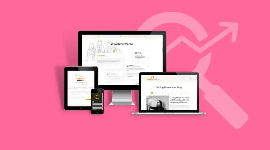
A full brand identity package and professional one-page website design complete with special features and an engaging blog section allowed this coach to continue positioning herself as a professional and expert in her field.

Background
After running her business on the side for two years, this coach was ready to take the next step and launch an official online presence to take her side gig off the sidelines.
The coach founding Momentum Marketing had worked with Third Angle before to successfully brand and launch websites for other business ventures. As a result, she did not need to consider any other teams for this project.
Brand Identity Components
With a blank slate to work off of, this coach was feeling a bit stuck landing on what the brand identity should look like. This coach leveraged the branding prowess of the Third Angle team to refine her vision.
Sarah worked diligently to ensure the branding components like the logo and brand color scheme would accurately reflect the person, the purpose, and the priorities necessary.


Website Design & Development Component
With brand identity in hand, Sarah then helped tactfully capture the most important information necessary for her new website with a series of thorough questions and prioritization.
Even with prioritization, there was a LOT of content to fit onto a one page website without overwhelming website visitors. To accomplish this, the Third Angle development team deployed the following enhanced features:
- Flip-able Information Cards
- Lightbox Information Cards
- Dynamic content sections for ideal desktop and mobile device display
- Scrolling Blog RSS features
Building a website requires balancing development prowess and a knack for web design. The Third Angle team married the two by including
- Images that change color on hover
- Non-traditional shaped CTA buttons
- Shadowing and section shaping to guide readers through the content
- Leveraging off-white neutral colors to achieve a warmth while balancing white space proportions
Outcome
In just a matter of a few weeks, this burgeoning coach had the professional brand identity and website she needed to catch her dream of helping others. Positioned for success, this client reported back to us that her website made her look fully legit and worth every penny in sales conversations she is having with new prospects.
