A good logo design does three things: establish trust, create recognition, and attract (the right) customers. So when a company doesn’t have a good logo design, it can be the source for confusion, poor impressions, and even lost business.
To clarify, a bad logo doesn’t mean it’s necessarily ugly. The logo design, itself, could be well designed and aesthetically beautiful but does not fit the business. That’s why it’s important to address these two important aspects when reviewing logo design ideas for your business.
(Don’t have a lot of time? Watch the Marketing Minute video What Makes a Good Logo)
You don’t serve everyone — and your logo should reflect that.
We’ve all heard the pitch, “If you (insert generalized group) then our (some kind of product or service) is for you!” But has that ever really worked? Your business isn’t for everyone so your logo should reflect that.
Think of it this way, how many bottled water companies are there? A drink that everyone on the entire planet drinks but every individual has a favorite brand of water. Now, you argue they differ in taste but most prefer a brand because of its perceived benefit. If this wasn’t the case, Fiji water wouldn’t be nearly $4 for a liter when 7-Eleven brand water is $2 for a gallon.
Who is it that you love working with and would love 10 more customers exactly like them? Seriously, think about that. We all know the customers we don’t want to work with, so why is it so hard to identify those we do want to work with?
Let’s take a look at XYZ Company’s unique value proposition:
XYZ Company is run by experienced professionals who strive to make every customer feel like they’re talking to an old friend. Their sales department is driven by relationships, not the bottom line and wants to establish accounts that last. Most of all, XYZ Company values a warm, relaxed, and simple spoken approach because others in their industry can come across uptight, confusing, and overbearing.
We know how they want to differentiate themselves from the competition but if we dissect it further we can pull what type of customers they want to work with.
XYZ Company is run by experienced professionals who strive to make every customer feel like they’re talking to an old friend.
The customers aren’t well versed in the topic so they seek advice but don’t want to be sold on something they don’t need.
Their sales department is driven by relationships, not the bottom line and wants to establish accounts that last.
The Customer isn’t driven by price as they value the ease of doing something over saving money by using a competitor that may be easier.
Most of all, XYZ Company values a warm, relaxed, and simple spoken approach because others in their industry can come across uptight, confusing, and overbearing.
The customer has been burned before and doesn’t want it to happen again.
Even though we do not have specific demographics the information gathered is enough to design a good logo for your business.
Your audience decides your logo — not you.
We just went over how to determine your audience but it needs to be emphasized. Your logo is not about you. Even if you’re creating a personal brand with your name. Your audience drives the look and feel.
Let’s refer back to XYZ Company. We have general information about their audience but let’s hone in on how they wish to be perceived. We can do this by analyzing the language used and focus on phrases that create mental pictures.
XYZ Company is run by experienced professionals who strive to make every customer feel like they’re talking to an old friend. Their sales department is driven by relationships, not the bottom line and wants to establish accounts that last. Most of all, XYZ Company values a warm, relaxed, and simple spoken approach because others in their industry can come across uptight, confusing, and overbearing.
Analyzing the language tells us 3 major things:
- Use warm colors (reds, oranges, browns, yellows, etc.)
- Use simple fonts (nothing too frilly like scripts or formal like Times New Roman)
- Integrate Some kind of injection of personality (this could be the color and font alone or it could be adding a symbol that brings an element of fun to the logo and removes it from being too formal)
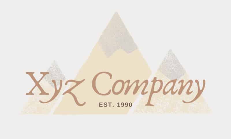
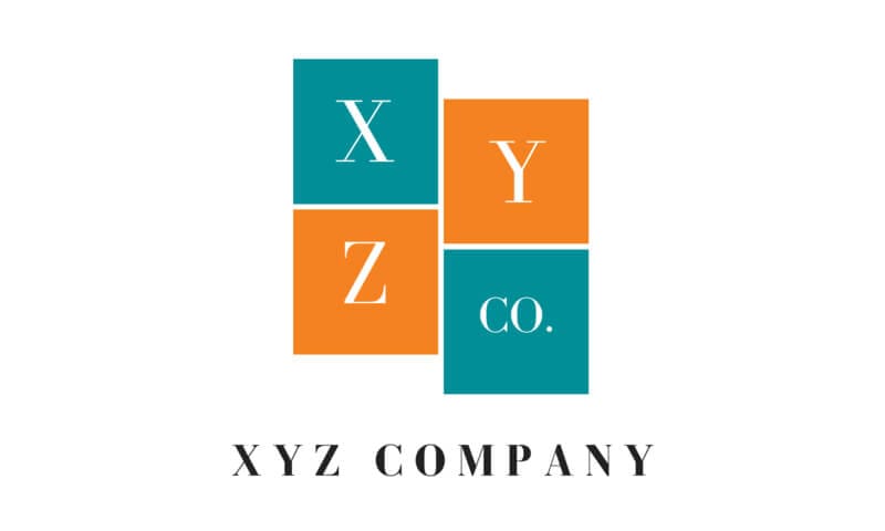
Take these two logos for example. While both state the same information, one presents an entirely different message. The key takeaway here is how do you want your business to be perceived by your target audience?


Once again, neither logo isn’t necessarily bad but one is clearly more suited to what the business is trying to convey to its audience.
What does your logo say about your company? A great exercise is to survey your customers about what they experience and feel when they do business with you. Pay close attention to the words they use because that can help develop better logo design ideas for your business.
