
8 Web Design Basics & Best Practices for Small Businesses in Colorado
Posted Jan 25, 2021 | Updated 3 years ago
By now there’s hardly a small business around whose owner doesn’t recognize the importance of having his business represented in cyberspace by an attractive, responsive website to attract prospective clients.
Business owners know a sharp business website is far more than an Internet-based business card. It is a sophisticated marketing tool with the potential to make or break a business.
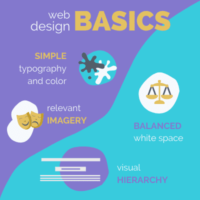
Good websites are both functional and nice to look at, so good web design utilizes these basic Principles of Web Design for a winning look:
TL;DR? Check out the Marketing Minute Video!
1. Pick Simple Typography & Color
We’ve all had the horror of loading that website that used the Comic Sans font in various primary colors (red, blue, yellow) and none of it seemed to convey the real brand of the business. Boy, that’s a trip for the brain, and usually a trip that ends on a competitor’s website, unfortunately for the original business.
As a general rule, decide on two fonts – three max – that you will use throughout your site. The more font families a website has, the more distracting it becomes, and the longer it takes to load. Also, fonts that look good on a PC might not perform so well on a cell phone.
Be sure the fonts you choose render well on all possible devices and limit yourself to two font families to ensure quick loading.
2. Use Relevant Imagery
Whenever you can avoid using stock imagery, do! Hire a local photographer for a couple hours and get some unique imagery that you can use on your website, across social media platforms, on your Google My Business profile, and for print marketing materials.
If you do need to use stock imagery, be sure to find imagery that matches the look and feel of your local city, the people you help, and the ways your business operates so that the images on your website are still as authentic as possible.
|
Pro-Tip: Use websites like Unsplash.com or Canva.com to find free business themed imagery that will be perfect for your Colorado Springs based website. |
3. Balance the White Space
Proper use of “white space” is another web design technique that increases user engagement. Our brains can only handle so much input at a time and the fast-paced flow of information that bombards the modern consumer during any given hour has reduced our abilities to process information in large chunks. (Simply, consider how much your mind is wandering while reading this short article.)
This means that your website design should break up sections with plenty of “white space” so that at any given point, there is only one subject on the screen at any given point.
Keep in mind, “white space” doesn’t have to be purely the color white. The concept of “white space” merely refers to spacing elements far enough apart that the content on display is easily digestible to the user on any screen size they may be using.
4. Use Visual Hierarchy
Visual Hierarchy is the design principle whereby you order elements by order of importance and use typeface alterations (such as boldness or all caps) to draw the eye to the message you are crafting. White space plays a large role, along with your typography, imagery, and call-to-action buttons in orchestrating the perfect visual hierarchy for your website pages as a whole and the screen sized sections specifically.
|
Pro-Tip: When designing your website pages, start by drawing out the sections on a piece of paper or whiteboard so that you can clarify your visual hierarchy before diving too far into the weeds of specific content pieces and website elements. |
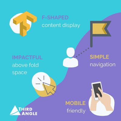
5. Design for “F-Shaped” Content Display
Your website design will be sure to get an A++ from users if you thoughtfully implement “F-Shaped” content displays. This means emphasizing your visual hierarchy and content placement such that someone can read the first several lines from left to right, then scroll past items, then stop and ready from left to right again, and then continue on their path down while still understanding the overall message of the page.
Keep in mind that, on average, only 20% of the content you write on a page will be read by any particular visitor, so cater to their short attention span by allowing them to get the gist of your full message by engaging in an “F-Shaped” flow.
6. Map Out Simple Navigation
When faced with a choice (or many choices) it is human nature to choose the easiest option – or the path of least resistance. A good website will make the journey as easy and fluid as possible for users.
The main navigation menu and each individual page should point people directly where they will find answers to their top of mind questions. A good website will minimize the number of choices presented at any given time, and whenever possible, give only one choice. Oftentimes this one choice is to either “click the button” or “not click the button” and keep on scrolling.
| Pro-Tip: Simplify your website’s main menu by not using any submenu dropdowns. To accomplish this, create long form website pages to house similar kinds of content rather than lots of smaller somewhat related pages. For example, rather than having separate “About Us”, “Meet the Team”, “Community Involvement”, and “Testimonials” pages you can create one longer page with all of that information so that in your Menu “About” directs users to all of this information in one click. |
7. Ensure Mobile Responsive Design
Regardless of what industry you’re in, your website needs to be designed first for mobile devices (meaning smartphones and tablets) because around 50% of all internet searches are conducted on these pocket sized computers of ours. If your website is not yet mobile responsive, learn more about quickly converting your website to a mobile friendly version in as little as two weeks.
8. Create an Impactful Above the Fold Space
And last but certainly not least, it’s imperative that the information displayed in the first full screen display of a page – known as above the fold space – sends a targeted message and drives further action quickly via a call-to-action. Not only do you need to ensure the message captures your visitor’s attention, but you need to prioritize loading speed as well. If your page takes longer than 3 seconds for the above the fold content to load, your website page will perform worse in search engines because users are likely to abandon the page before it even finishes loading.
Hiring a Website Development Agency in Colorado
If you’re feeling overwhelmed trying to develop your business website on your own, we can help! We’ve worked with countless local businesses in Colorado Springs to craft compelling marketing messages and engaging web designs among other marketing services. Contact us today or click below to learn more about our website design services.